Thursday, June 14, 2012

Spider-Men 01


Writer - Brian Michael Bendis
Artist - Sara Pichelli
Colorist - Justin Ponsor
Letterer - Cory Petit

I came into this read with extremely negative expectations. I remember way back when the Ultimate Universe was still in its infancy and it was outright stated that they were never going to do a crossover. But that was 10 years ago and as Bendis has pointed out in an interview about the crossover, "Things change." It just seemed gimmicky and lately, gimmicky has taken precedence over quality content and depth, such as with Marvel's AvX and DC's New 52 for the most part. Lately Bendis has just not been impressing on a lot of his titles. There is one thing that Bendis knows how to do well and I have always enjoyed and that is his writing on the Ultimate Universe. One of the reasons I had such reservations about this arc was because this arc would be a crossover of a universe that Bendis writes that I love and a universe that he writes that I have been thoroughly disappointed. 

After having read the first issue, I am tossing all that fear and those pesky reservations out the window. I enjoyed this series so much I was shocked. Bendis was writing like he was BENDIS again. The writer that can do no wrong. The writer that creates a story that you cannot help but get sucked into. Funnily enough, it only featured regular Spider-Man almost the entire time. Bendis has certain flare for comedic writing where Spider-Man is concerned. If only AvX was written like this. But to be fair, I think Bendis has a stronger understanding of Spider-Man than the characters littering AvX, he has been writing Spider-Man for a decade (even if it was the Ultimate Universe one).


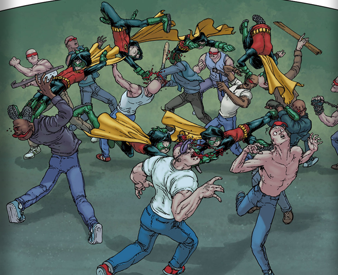
The art is a knockout. Ultimate Spider-Man readers will recognize the work of Pichelli right away. She has been on most of the new Ultimate Spider-Man run and did a few issues from Death of Spider-Man. It just fits perfectly with Bendis Spider-Man writing. Comedy in comic books is just as much on the shoulders of the artist as it is with the writer and I can think of few artists that could be better for this mini. Something about it reminds me of Amanda Conner, one of my favorite comic book artists. The action is solid as well. It just looks realistic. No issues with the art at all for this one. Pichelli was someone I have kept an eye on for a few issues but now she is climbing the favs list. 


The story is pretty straightforward. Spider-Man (the regular one) is thinking about how he loves New York and beating up a few baddies when he sees some energy blast come from a dilapidated building. Turns out someone got their hands on Stark tech and that someone is Mysterio! Punch, kick, quip and webs ensue and Spider-Man is thrown into the energy coming from the Stark tech. Suddenly he is in a New York that is familiar, yet different. Hilarity ensues as he attempts to be the hero he is and people react to his costume. For those of you who do not know why... shame on you!


Overall I felt this first issue did its job of getting me interested and then some. I most certainly will be getting the next issue that comes out and I hope you do as well. It is a solid 4.8/5. My only gripe is that this issue had a lot of splash pages. Splash pages are great but sometimes, less is more and it felt like an extremely fast read because of it. 

Wednesday, June 13, 2012

Scarlet Spider 006

Writer - Chris Yost
Artist - Ryan Stegman
Colorist - Edgar Delgado
Letterer - Joe Caramangna/Ryan Stegman


I have been loving this series so far. Kaine has been a thoroughly enjoyable character that has very human struggles. He is a man that is good at his core but struggles with who he used to be and because of his past, he sees himself as a villain. But beyond that, what makes him interesting is that he wants to be good. 

This issue was really good. We got to see so much; how the city of Houston saw him, his internal conflict, his friends and some crazy fighting. I did not like a few things. They gave Kaine a tattoo. This is a problem for me for two reasons. One is that he is supposed to have durability enough where something like a tattoo needle would have no effect. He also has a healing factor, not on the order of Wolverine but over time, I would think his body would erase the tattoo, so getting one is pointless. Then there is the fact that the tattoo just looks ugly. I love tattoos but I think if you are going to get one, you might as well make it something that looks good and not like that ridiculous crap he put on his arm. This is just something that artists will have to deal with later. I hope they just phase it out like it never happened because it just looks terrible. 


Other than that, the issue was spectacular. I hope this issue is getting the number to support an ongoing series because this is one of the few titles Marvel is putting out that is worth buying. The art is enjoyable in a cartoony kind of way. I personally prefer a more serious or dark kind of art, especially for a series that deals with a protagonist like this but other than that, there is nothing wrong with this art at all. Stegman does a fine job and is consistent throughout his time on the series and it is appropriate during the light moments of the series such as his time with his friends, especially with Aracely. 


The fight with Ana was very well done. He is well beyond her in stats but he also does not have a spider sense like Spider-Man does and she seems to be the superior fighter. It also helps that she prepped the fight and had a few advantages. But both characters were treated with respect and I love that in a character fight. 


Overall this issue was a 4.4/5 for me. Loved it but it was not the best issue for the series to date. I am eager to see what happens in the next issue though with the reveal on the last page. This series is only 6 issues in so I seriously recommend picking it up. Doubly so if you are not interested in the AvX event that is going on right now with Marvel. 

Thursday, June 7, 2012

Age of Apocalypse 004

Writer - David Lapham
Artist - Roberto De La Torre/Renato Arlem
Colorist - Lee Loughridge
Letterer - Cory Petit

This series is my second favorite post apocalyptic dystopian comic series next to The Walking Dead. It does not play at being edgy like DC's New 52, it outright is hardcore edgy comics. Never does an issue arrive that is not packed to the gills with blood. One of the coolest things about it is pretty much what was one of the coolest thing about this series when it came out in the 90s. We get to see some of our favorite characters in a dark mirror. Like Star Trek's Mirror Universe. Often the bad guys in the regular universe are now the heroes and the heroes in the normal universe are now the big bad scaries. There are some characters that are already standout favorites of mine. Jean Grey and Prophet. They are just oozing badass. If you read last month's issue, you know how much of a BAMF Jean is now. She sweep kicked some dude! Top ranked fighter for sure!

This issue dealt mostly with Fiend's capture. She had killed Abyss upon his resurrection and destroyed some necessary plasma lines to Beast's equipment before being caught. Elsewhere Goodnight is trying to convince Bruce Banner to become The Thing and help his friends out. Without giving away too much of the issue, Prophet shows up and does what he normally does, which is show his complete genius where tactics are concerned. He also intentionally brings a mutant back to life, which surprised me a great deal but it seems to me that out of all of the humans, he is one of the few that have no hate for mutants as a species, seeing them only as humans with power. The mutant he brought back to life is one of my favorite lesser known mutants in the 616 universe (that is the normal universe to you comic noobs). As far as choices go, this is probably the best one considering the mutant's power set.


I was a little let down in the issue due to the cover. It implied that we were going to have a major smack down, drag out fight between Weapon Omega (Wolverine) and The Thing (Hulk) but all we get is a few panels. The fight could barely be called that. I know we have seen Wolverine vs Hulk a million times so maybe the writers just felt like it was so overdone that we could just skip it, but in my opinion, it is overdone because people love seeing it.


That is really my only complaint. The art is fantastic in a dirty, gritty kind of way and the plot is not overly complex but leaves a few things in the dark so we want to come back next month and see what happens. I honestly wish more comics would take a page out of this book's bindings and follow its formula, especially the more "popular" titles.


If you are a first time reader, this issue will not leave you in the dark. Assuming you can read the two paragraphs on the first page, you will be brought up to speed on everything you need to know. So I would even recommend this issue to new readers. Overall I give this issue a 4.7/5. A mostly pleasing issue with the only problem for me being the Hulk/Wolverine fight. However, this also will have my favorite mutant in the upcoming months so it almost made up for it.

Saturday, May 26, 2012

Captain America 012

Writer - Ed Brubaker
Artist - Patch Zircher
Colorist - Paul Mounts
Letterer - Joe Caramagna

This is my first read for the Captain America volume. It is the second issue in the "Shock to the System" story arc. I was worried that I would be kind of lost without having read Captain America 11, which started this arc but I had no such problems. Everything I needed to know was on the first page. There is a new Scourge villain but this one believes what he is doing is saving America. Gyrich is his handler and used to be a high ranking politician/patriot that Captain America got fired last year. Gyrich has a hate for supers and is being brainwashed by Hydra to make political war on supers which resulted in Scourge critically injuring Diamondback, a reformed villain.  Very easy to settle into. Actually, everything about this issue was easy to digest.

I was very pleased with the art. I am new to Zircher's work but I like it a lot. It reminds me of Jae Lee's work in a way. I think it is the heavy shadows. It has a very grounded style. It feels real and organic. The action was also handled very well. Captain America dominated. As a matter of a fact, it seemed like Captain America was unusually invested in the mission, which was gathering intel on Gyrich, his boss and Scourge. He seemed to have no problem with Dum Dum Dugan gunning down Hydra agents. But it could be reasoned that Cap was highly upset because his history with Diamondback (they dated for a short time).


So Cap and Dugan plow into a Hydra facility and wipe everyone out. They get some intel they were looking for but it turns out that the intel was a gift from Gyrich's boss, Bravo. Cap notes that finding anything beyond that point will be extremely difficult and we jump to Scourge taking on a D-list villian called the Rattler. During the course of the fight, Scourse's mask is broken and we get to see who the dastardly vigilante is. It turns out that Scourge is... Oh like I am going to tell you. If you want to know, and you really should because this story is really good, then you should go out and get it for yourself.


Overall this issue really made me want to go back and read the previous 11 issues. Not because I felt I needed to catch up, but because I honestly feel like the writing was spectacular and I really wanted to see more Captain America stories by Brubaker. And if you need one more push, this story arc has absolutely nothing to do with the dreadful AvX Marvel event. That alone should make you throw your money at the comic book store you frequent. I give this issue a 4.6/5. A great issue to get you into the series.

Thursday, May 24, 2012

Batman Incorporated 001

Writer - Grant Morrison
Artist - Chris Burnham
Colorist - Nathan Fairbairn
Letterer - Pat Brosseau
Editor - Brian Smith/Mike Marts/Ricky Purdin


I can only review this issue as a reader that has not read any of the issues from the previous Batman Incorporated series. I decided to pick this issue up because of the ridiculous praise this issue has gotten, it had Grant Morrison as the writer and because it was a first issue, which is usually the perfect time to jump into a series. However, I felt like I was getting the middle of a ongoing story here.


A face only Burnham could love
Honestly, I have no idea why this issue is getting so much praise, it is nothing special at all. The writing is just okay. The dialogue was decent but I found Goatboy's narration tedious and unoriginal. On top of that, the plot was just weird. Batman and Damian chase a few baddies into a slaughterhouse and while some of the workers are actually more goons, others are not and those innocents just keep on doing their work despite a super hero battle happening right in front of them with swinging chainsaws and gunfire. Maybe that was supposed to be a joke about desensitization with society or whatever but I just did not get it. And Damian adopting a cow and becoming a vegetarian? I guess it would be funny to some. Then there is some quick jump to the Leviathan organization, showing them take over a west side criminal organization called The Brother's Grimm.


The actual plot for this issue is about Damian's mother Talia Al Ghul, having put a price on Damian's head and every assassin around was trying to get a piece of that pie. But the one that is at the front of the race is some pathetic cabdriver/mercenary that just wants the money for his kid.  Goatboy also accidentally killed a friend of his that honestly seemed more deserving of the name. I cannot figure out if the guy that was shot was wearing a mask or if that was his real head. Most masks do not show various expressions or have long goat tongues fall out when killed. Someone told me that if I was put off by gore in comics, I would not like this issue but that is not true. I do not really care for this issue because it is just not that interesting. As for gore, I read Crossed and The Boys. This was nothing by comparison.

The art was no better. At first I seriously thought I was reading a Frank Quitely issue. It took me a while to realize that it was someone just trying to draw like him, which in my opinion is not something that one should strive for in a comic book. Not that I really have a problem with Quitely or the artist that emulated him Chris Burnham strictly from an art appreciator point of view. I just think everything looks ugly. The characters, the environment, the scene transitions... all ugly. And this might be me just nitpicking but I like the art in the comics I read to look good. The proportions are just weird and there is a sloppiness about the whole thing that I do not care for. One thing I did like was the action scenes though. Burnham does seem to know how to make his fights look pretty cool.


Now, despite all my grievances, this is not a terrible issue. I am listing a few reasons why I do not believe it is worthy of all the praise it is getting. It does seem like the wrong issue to start with for a new reader, which is odd considering it is the first issue in a series. It is just not new-reader-friendly. The issue itself is not actually bad, just weird. I think it would appeal to Batman fans and readers that have a strong affinity towards quirky and odd comics. It just did not work out for me. Overall, I just felt like it was okay. A 2.7/5 seems about right for me. I do expect some serious rage from Batman or Morrison fans over my rating but it will not change my opinion of it as a new reader.

Spoiler for those that have not read the issue, Damian supposedly gets shot in the head but we never see it and he conveniently has his head covered by his hood when Batman is screaming to the heavens while holding his dead boy. I hate stuff like that. It is a weak attempt at a hook and we all know Damian did not really get shot and they will have some lame excuse why Batman and Damian played along. I actually wish he did get shot just for an actual surprise.

Monday, May 21, 2012

Justice League 009


Writer - Geoff Johns
Penciler  - Jim Lee/Gary Frank
Inker - Scott Williams
Colorist - Alex Sinclair/Peter Pantazis/Gabe Eltaeb/Brad Anderson
Letterer - Pat Brosseau/Nick J. Napolitano
Editor - Brain Cunningham/Darren Shan

There were a lot of big names on this issue. Jim Lee, obviously one of the most notable among them. I happen to love Gary Frank's work as well. In fact for me, Frank is the main reason I picked up the issue even though he only had the 11 page short at the end of the main issue.

Let's start with the Justice League portion of the issue. Jim Lee is an amazing artist and anyone that says different is just trying to be a tosser. There is no disputing the fact that he makes the characters look good. I do like that Steve Trevor has been moved into the spotlight more than in before the New-52 came about. Post Crisis, Steve Trevor was old enough to be Wonder Woman's father and was very much a minor character, which is obviously very different than the Pre-Crisis universe where he had a much larger role. Now he is a main character in the Justice League. In fact, he is the most important strictly human character in the series. Superman, Batman and Cyborg's team up was the focus of the issue as well as Steve Trevor this time around with Flash, Green Lantern and Wonder Woman's team up seemed more like a side-note to give us a little more information about the new villain, Graves.


The story just did not get me. I have a hard time thinking that a man that used to idolize the heroes fell into wanting to kill them just because it seems he was not noticed by them. And why is it that every single wealthy man in comics is capable of turning himself into a team busting super villain rather than funding someone else to do it for them? It just does not seem like a very engaging story beyond the run of the mill punch-splosion issues you can get anywhere. I kind of want a little more from a flagship issue of a company.

Another thing I would like to voice an opinion on is the flashbacks. They did not feel very organic. Clunky and awkward would be the words that come to mind when thinking about them. I appreciated them, I just think they could have been shown better, be it in different sections of the issue or just shown in a different way.


Don't get me wrong though, I did not necessarily feel like I wasted time reading this issue, I just look at the Justice League like how one might look at one of those empty action movies. Just cheap, leave your brain at the door, popcorn fun. And that is okay, but I would prefer these kind of stories in less "important" titles. The Justice League was a decent book. I give it a 3.5/5 for almost being good, the art being the saving grace.


Now onto the Shazam section of the issue. I cannot praise Gary Frank enough. His work on Superman: Secret Origins is largely why it is still one of my favorite Superman stories. This art is just awesome. It is engaging all by itself and you can really tell what characters are thinking with their expressions. So bottom line is that the art is yummy.

The story was interesting in its own right. I felt like I actually cared about these characters, this family of orphans. I find myself relating to Billy. He reminds me of myself as a youth. The point (without making my audience into my therapists) is that I actually have no trouble buying into his emotion, which sucks me right into this story like it is a black hole.


Shazam will definitely have my money if it keeps this creative team for sure. I want to know more about every character and see how their relationships with one another will grow and evolve. If you like quality comics, get the new Justice League issue just to support the idea that it might turn the Shazam series into its own individual title. Quite simply the best part of the issue. 4.5/5 for Shazam bringing the overall score of the issue to a 4/5.

Thursday, May 17, 2012

Incredible Hulk 007.1


Writer - Jason Aaron
Penciler - Jefte Palo
Colorist - Frank Martin
Letterer - Chris Eliopoulos
Cover - Michael Komarck
Editor - Mark Paniccia
Assistant Editor - Jake Thomas


The first thing I noticed about this issue was the cover. I have never seen Komarck's art before but I can honestly say that he is awesome. The lines, the rendering, everything about this cover is something I would want hanging on my wall as a poster. Just a fantastic piece of work.
Then we go inside and get art that I love just as much from Palo and Martin. I have never been a Hulk fan. I have never really understood how Hulk could carry his own title. To me, he has always seemed like a plot device used as a way to give the Avengers or Wolverine something to punch. But I like this art so much, I would stick with the series at least for an entire story arc because of this alone.

Fortunately, we have Aaron on as the writer and in this issue anyway, he is well suited for it. When I first became aware of Aaron, he had started the Weapon X series and it was phenomenal. He seemed to understand Wolverine through and through. But then Aaron moved to other titles and my love of his writing fell into incredible disappointment. But here, he does very well. It is easy to understand what is going on, even though I never read the previous story arc or any Hulk issues for that matter. It turns out that .1 is in fact, a decent jumping on point.
First thing we see is Red She-Hulk bashing Hulk's head in three days from the present. Then back to the present as Hulk and Amanda Von Doom giving Bruce Banner a mock eulogy, dumping his ashes into the ocean in a concrete/lead casket.


Hulk then goes off to party a bit and we get a few laughs from it. But all is not well in Hulk's mind. Something nags at him but he will not admit it. So once those three days of fun are up, Hulk is in a bar trying to drown his troubles with booze like he has known Wolverine to do. Red She-Hulk shows up and we bounce over to a robbery with Orb and his Orblings. I have to say that it is nice to see Orb back. I thought he brought some levity in Astonishing Spider-Man and Wolverine.


The funny parts were funny, the action parts were actiony and the sexy parts were sexy. I am actually interested in what this series has for me in the future. Will I stay on or will I jump off in a matter of a few issues? I have no idea but based on this issue, I will at least give it a shot and see if I can in fact, become a Hulk fan.
I give this issue a 4.3/5. A completely enjoyable issue.

Monday, May 14, 2012

Deathstroke 009


Writer - Rob Liefeld
Penciler - Rob Liefeld
Inker - Jacob Bear/Adelso Corona
Colorist - Matt Yackey
Letterer - Travis Lanham
Editor - Brian Smith

I have had the pleasure of reading the first two Higgins issues on Deathstroke before picking this up so I could compare the two takes on Deathstroke. I have never been a major Deathstroke fan but I never had a problem with the character either. I mostly was ignorant to his appearances in Pre-New 52. I have been told that Higgins was ruining Deathstroke. After reading Liefeld's first issue on the new Deathstroke series, I just do not see how that is possible.
Everyone is aware of how terrible of an artist that Liefeld is so I do not feel the need to go into it too much here but I will say that it is not Liefeld's worst work ever. However, I absolutely do not credit Liefeld with any kind of growth at all from his work over the years. In fact, Liefeld seems to firmly and intentionally be against any kind of growth or effort as an artist or a writer. I honestly do not understand how he keeps getting work, Liefeld is just lazy.
I will give Liefeld $100 if he can actually make his body look like whatever this is.
Unbelievable and laughable proportions aside, Liefeld just does not seem to be able to deal with continuity as an artist from one panel to the next. I wonder if when the inkers got the penciled pages handed to them, they let out an audible sigh of disappointment before going to work trying to figure this stuff out.
Then Maxim's glasses seem to phase in and out of reality...
In fact, the only consistency seems to be with Zealot's facial expressions.
Then there was the writing. I swear I was reading a comic from the 90s and that is a very bad thing. Deathstroke seemed way too impressed with himself and made death threats to everything that moved in the issue, for no other reason than it makes him "badass" to do so. I do not remember reading so much big talk bravado nonsense in a recent comic. If we cut away the emtpy filler badass talk, we would not even have half the issue. Someone told me that this version of Deathstroke had depth and I seriously am wondering where the hell that is supposed to be. Is it at the beginning where he is narrating about how tortured and seemingly suicidal he is? At how killing endless troves of people and making incalculable millions have not filled the gap in his soul? Yet somehow this new contract is supposed to fill that gap? The plot seems rather contrary to his inner monologue. And I love that by smelling an opponent and using his mega-hyper battle brain, he can determine that his opponent is a "level 7 telekinetic alien" and can tell what moves you make before you make them. What?! Are we talking about Deathstroke or Midnighter here?
Then there is Lobo. I never cared for Lobo because he was absolutely a ridiculous joke character that was created to be over the top. But here it seemed like Deathstroke and Lobo traded places in how they are depicted. Lobo is the gruff and serious one and Deathstroke is the campy, dick measuring, self promoting badass.
I tried to glaze over a lot of my grievances because it is Liefeld and what else can be expected of him? But really there is nothing to praise in this issue. The art is bad, the plot is childish, the dialogue is antiquated and the scene transitions just do not tell an interesting story. It just is a bad issue from a comic reader standpoint. I would be extremely surprised if a reader willingly puts money down on this issue AFTER reading it first.
I give this issue a flimsy 0.9/5. Not the worst issue ever but it is not something I would ever care to read again.

Sunday, May 13, 2012

Invincible 091


Writer - Robert Kirkman
Penciler - Ryan Ottley
Inker - Cliff Rathburn
Colorist - John Rauch
Letterer - Rus Wooton
Editor - Sina Grace

This was an issue about everyone else rather than Mark. In fact, Mark is barely in the issue at all. As far as the series goes, it would normally be a rather unnecesary read but the final page caused me to do a 180 on that opinion.
It was just filler for the next issue but we do find out exactly the kinds of effects the disease has had on Mark. Rather shocking to be honest. I have followed this series since day one and it has been a blast the entire way. Lately I have been getting the feeling that Kirkman is phasing Mark out. If this happens, I honestly do not think I will continue with the series. Everyone in this series is enjoyable to read for the most part, but I learned today that they are fun WITH Mark. By themselves, not so much.
We did get to see Oliver, Allen and Atom Eve. These three are the best supporting characters in the series. They fought some monster thing that had no apparant consequence to the series (more filler) and were shuttled off to find Mark, since he was taken from Thragg last issue when Dinosaurus found Thragg trying to murder Mark while he recovered. There was a scene I really liked with Eve near the beginning of the issue though. She got pretty badass when she thought Mark was in danger and even though Thragg laughed it off, it was still a cool thing to see.
As always, Ottley is a phenominal artist and absolutely perfect for this series. He just tells a great story even when nothing is going on in an issue. His art is just fun to look at.
There is a fight at the end of the issue with Dinosaurus against Allen, the New Invincible and Oliver but that is not the interesting part of this issue. No the most interesting part of this issue by far is how the sickness has hurt Mark. I will not spoil this for any readers that must want to enjoy it for themselves but you can expect a traditional Kirkman shocker. My face when I saw this final page was much like Mark himself when he saw Oliver just before.
Overall I would give this issue a 2.9/5. It was just okay. It was not bad at all but if you are pressed for cash, I would say skip this one in place of must have issues this month.